No, I’m not going to download your bullshit app

In the “web vs. apps” war, I think you can infer which side I’m on. I wouldn’t download a BBC app or an NPR app for my computer. Why would I want one on my phone? Do I buy a separate radio to listen to different stations? No. The functionality is the same, the only thing that differs is the content. Apps ought to provide some actual functionality, not just blobs of content wrapped up in binary files.

Tom Morris

The worst thing in this fashion i’ve encountered was the Haaretz iPad app. Not only it provided you a worst visual design than the site, but it keep bothering me for a paid subscription and not allowing me to read news that were freely available on the website. I’m sure there’s some hidden wisdom on this sort of behaviour but i fail to see it.

Courier Prime – A Courier made for screenplays.

It’s Courier, just better.

Since the beginning, screenplays have been written in Courier. Its uniformity allows filmmakers to make handy comparisons and estimates, such as 1 page = 1 minute of screen time.

But there’s no reason Courier has to look terrible. We set out to make the best damn Courier ever.

We call it Courier Prime.

Quote-Unquote Apps

A freely downloadable redesign of Courier. I actually never used Courier because i always found it quite ugly, but i’ll try this font the next time i have to write something that requires this graphic appearance.

Working with the Chaos Monkey

We’ve sometimes referred to the Netflix software architecture in AWS as our Rambo Architecture. Each system has to be able to succeed, no matter what, even all on its own. We’re designing each distributed system to expect and tolerate failure from other systems on which it depends.

If our recommendations system is down, we degrade the quality of our responses to our customers, but we still respond. We’ll show popular titles instead of personalized picks. If our search system is intolerably slow, streaming should still work perfectly fine.

One of the first systems our engineers built in AWS is called the Chaos Monkey. The Chaos Monkey’s job is to randomly kill instances and services within our architecture. If we aren’t constantly testing our ability to succeed despite failure, then it isn’t likely to work when it matters most – in the event of an unexpected outage.

Which, let’s face it, seems like insane advice at first glance. I’m not sure many companies even understand why this would be a good idea, much less have the guts to attempt it. Raise your hand if where you work, someone deployed a daemon or service that randomly kills servers and processes in your server farm.

Now raise your other hand if that person is still employed by your company.

Who in their right mind would willingly choose to work with a Chaos Monkey?

Jeff Atwood – Coding Horror

Big Words

The biggest issue I have with the original Nielsen’s post is that it uses an age-old trick to fool people into thinking this guy knows what he’s talking about, and far too many have taken the bait. That is, it hides the tenuous nature of its argument behind many, many big words and phrases. These all sound intelligent, thus the author must know what he’s talking about and you should believe him.

I’m referring to things like “cognitive overhead,” “added memory load for complex tasks,” and my personal favorite, “low information density.” That last one is classic because, as you know, what we’re all looking for is “high information density,” like those busy blogs and web sites where you can’t tell ads from articles and everything is blinking and screaming at you.

Dueling Views on Windows 8 Usability – Paul Thurrott’s SuperSite for Windows

Yes, it’s the messenger’s fault because he uses “big words”. Things so hard to understand as “cognitive overhead” or “low information density”… [sarcasm!]

I’m no usability expert, or english major, or even an english native speaker but somehow these terms don’t seem farfetched or undecipherable to me. Can i help with its translation to a “simpler english”? Allow me:

  • Cognitive overhead – Makes you think too much. Does this really require explaining? (( if it really does, think about your car. you can drive your car with a vertical line of buttons, randomly ordered and completely illogical such as “park,left,brake,accelerate,forward,right,reverse”; or you can simply have the logical and standard driving wheel, two foot panels and an automatic transmission selector. Which one do you think will have a significant “cognitive overhead” for the daily act of driving? ))

  • Added memory load for complex tasks – you have to memorize more/too much things to do some trivial tasks. And we are notoriously bad at memorizing complex,”illogical” paths for short-term/occasional use. In this case the original author was referring to the simple fact that because you can only see a single window at a time, (( or two in an unusable 80/20 split )) you have to memorize the information you want to act on, so that when you change applications you remember it to use it. Can we agree that this is cumbersome and inefficient?

  • Low information density – You have a lot of wasted area that doesn’t really help you. Somehow this was transformed into a pejorative “because we really need a full blinking flashy site right?” but Paul Thurrott failed to see that what you usually want is an adequate/reasonable level of information density. You don’t need to have the screen filled with blinking lights and numbers but you don’t need to have a 27″ screen filled with a colored background and a single central paragraph either. Sometimes you will want a “medium” information density (something around half to two thirds of your screen filled with info), and sometimes you might even want a really high information density, but i fail to se why would i ever want the waste of screen real-estate by present Metro apps.

On the whole Paul’s criticism of the original article is baseless and fallacious. Because the author uses some mild technical jargon he’s automatically wrong?

Also, Paul states:

“For example, Office was once designed so that all the toolbars were similar, with the assumption that this would aid users in moving from application to application. It sounds right. But it was based on absolutely no research at all, and over time, Microsoft found that users can handle completely different UIs. It’s why one person can use an Android phone, an iPad, and a Windows PC and never get confused. Completely different systems. But we’re just not that dumb.”

He’s right, we aren’t. But exactly because of that, we are also very careful regarding where we waste time learning new stuff or where we just stick to the old one that works. I love technology and trying out new stuff, but when i do find something that “scratches my itch” in a perfect/usable/understandable and reliable way, i tend to stick with it. Why would i waste my precious time learning some new X program that doesn’t really add anything new to my old program except the need of re-learning how to do stuff again? I’d rather spend that time learning some other new program/language/system that actually introduces me to new stuff and new things. What works, works. Keep it.

We can use and learn, and many times we even prefer, different user interfaces when we find it more practical or mode adjusted. The iOS and Mac OS X different approaches are a perfect example of this, I prefer the way iOS works on a touch small screen and i wouldn’t have Mac OS X interface on it even if i could. I realize that I use them for different purposes, with different goals and in different uses, so i prefer to have different interfaces with different strengths. I like some cohesiveness in both obviously, like the bottom Dock for instance, but overall if they are for different purposes they should adjust the way they work differently.

What Microsoft provides us with Windows 8, is nothing of this. It’s changes the way you did things on your old desktop system, with no particular benefit only to try to force you to use their touch products, where they fail absurdly because they didn’t went far enough and still drag all the desktop stuff behind. So instead of your old interface that you knew and worked and a new sparkling interface well thought for a new class of devices, you get a mishmash of both that serves no-one. Every time i see a Windows Explorer on a touch tablet i shudder. The great thing about an iPad is that it just works! It sits there quietly and i pick it up to check who was the cute actress on that movie/series/program and it’s there reliable and just as responsive as if unpacked 5minutes ago. Why, oh why, would i want to mess around in a kludgy, messy Windows Explorer window with tiny buttons and unresponsive experience!?

So, no, the fault is not from the messenger that actually did some research on the subject.

Prayer

Maybe with Sir Ives in charge of the interface, good judgement will prevail and we’ll see the return of an elegant system that lets me be creative rather than vying for the spotlight with pointless bells and whistles.

a commment in previous Macworld article

So say we all.

OS X Snow Leopard shows signs of becoming Apple’s XP

Snow Leopard has lost more than half its share of all Macs since Lion’s appearance over a year ago, but so far it has been resistant to Mountain Lion’s call to upgrade. In each of the last two months, for example, Snow Leopard’s losses were less than its 12-month average.

Apple also, perhaps just temporarily, extended security support for Snow Leopard when it issued a patch update for the three-year-old operating system in late September, confounding security professionals who had assumed it would stop serving OS X 10.6 with updates, as it had done with earlier editions once two newer versions had been released.

Snow Leopard is no Windows XP – for one thing it’s less than one-third as old as that 11-year-old OS from Microsoft – but the comparisons, what with both posting slow-but-steady declines and their makers’ extending security support, are intriguing.

It’s unclear why Mac users are holding on to Snow Leopard, but one factor may be that it is the newest Apple OS able to run applications written for the PowerPC processor, the Apple/IBM/Motorola-designed CPU used by Macs before Apple announced a switch to Intel in 2005. The first Intel Macs launched in January 2006.

Macworld

Another answer is because mainly both Lion and Mountain Lion suck in usability and productivity, by Apples’ stupid chase of the mythical “virgin new user”, wich somehow managed to avoid any contact with computers, even though in 100% of the countries with sufficient GDP / capita to purchase Apple’s hardware products, you have IT training at one or more levels of your mandatory school education.

There is a great quote by Sir Jonathan Ive that pretty much summarizes the mistake that Apple has been doing:

“Simplicity is not the absence of clutter, that’s a consequence of simplicity. Simplicity is somehow essentially describing the purpose and place of an object and product. The absence of clutter is just a clutter-free product. That’s not simple.”

Which can be translated to something like, for example, this:

hidding the User’s Library folder, does not make it any more simple, it just removes some possible “clutter” but that’s not any more simpler, in fact it’s even more complicated because now the user has absolutely no idea of what to do or where to go when he wants to or needs to fix some program default settings, install fonts, copy his email folders, etc etc.

It’s essentially like welding your car’s bonnet. (( hood for you americans. My english-as-language education was with a british BBC-english speaking teacher. )) Yes, you avoid the “clutter” of another lock and the nuisance of another lever in your cockpit, but that seriously doesn’t make it’s usage or maintenance any more simpler than it was before.

Zig

As to the iPhone 5, the build quality I’ve seen is top-notch (both black and white alike), and after the first few minutes of thinking “boy, this thing doesn’t really fit in my hand”, that feeling tuned out. Still, while grabbing it off a desk to test a few things I kept finding it subtly off — like an unshaven Buddhist monk.

Truth be told that I’ve handled a number of “larger” phones recently, and those felt odder — unshaven Buddhist monk wearing fuchsia robes kind of odd, just about — and I dislike anything that won’t fit into a trouser pocket and stay there.

The Tao of Mac

Haven’t seen one in real life yet, but seriously i hate what i have read and seen about it. Apple seems to have forgot a simple truth in what regards to customers. Don’t force annoying changes in to stuff if there isn’t a clear benefit worthy of the hassle.

We changed the screen size (annoyed the developers), the actual physical proportions (annoyed the customers and case makers) & the connector (royally annoyed anyone that already had some hardware prepared for the old 30 pin connector), all this for getting a ligher “tv remote” shaped phone. Which is like 30 grams lighter or something. Hurray.

Doesn’t make sense. I would buy an “old” iPhone 4 or 4S instead of a iPhonr 5 any day. Too much drawbacks, not enough advantages.

Website pagination: Stories should load into a single page every time

I don’t disagree that these are nice benefits from pagination. But I think that thoughtful design can improve how long articles look on the Web. One example of this is the Verge, which publishes very long pieces every day and makes them look stunning and manageable without page breaks. In its long pieces, the Verge breaks up blocks of text with photos and design elements like pull-quotes, and each article has internal navigation buttons that let you go to specific sections of the piece. (In this review of the new Kindle, for instance, you can click on “Hardware” or “Software, battery” to scroll directly to those topics.)

I asked Joshua Topolsky, the Verge’s editor, whether he had a hard time convincing the advertising sales department at the magazine to ditch pages. He said he didn’t: “From the beginning, there’s been a company-wide belief that we can marry great advertising with great content and not have to cheat or trick our users,” Topolsky emailed. “And so far, that’s proven 100 percent correct. Our traffic has been on a big climb, and I believe advertisers are really beginning to see the true value in engaged users who care (and return) versus sheer volume of pageviews (though our pageviews have also been through the roof).”

Slate Magazine

Compete Report: Apple iOS 6

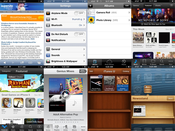
One weird thing about iOS 6 is that Apple’s built-in apps are suddenly even more inconsistently designed than ever. Some apps, like Safari and Settings, retain the old blue-gray look and feel, while others are dark gray with black accents (Photos, iTunes, App Store) or just dark gray, light gray with dark gray accents (Music), a new bluer-gray (Videos), or faux-wood (iTunes U and Newsstand, both of which—seriously—feature differently colored wood designs!). I await someone’s impassioned defense of this Crayola strategy.

iOS Inconsistencies in interface

If you are using an iPhone, iPad, or iPod touch, iOS 6 is of course a necessary upgrade, even with the Maps silliness. Looked at from the outside, however, there’s not much here that’s worth fretting over. If you’re using Windows Phone or Android, you can at least rest easy knowing that only Apple’s devices are truly lust-worthy, and then only until you bring them out in the real world and scratch them or break the screen, which is especially a problem for iPhones. But the iOS software that runs on these devices is showing its age. And Apple shows no indication that it’s ever going change that from strategy. This is a big opportunity for the competition.

Paul Thurrott – WinSupersite

Couldn’t agree more. Apple should really take a break, and decide where it’s going in the interface area. And then do a full house cleaning, both on iOS and Mac OS X. This mess is ridiculous and seriously makes me doubt of what will be Apple’s future. I intend to use my Macbook another couple of years, easily. But when I finally need a replacement, will Mac OS X still be the incredibly usable and clean OS that I “fell in love” with?

A couple of years of ago, even though I seriously hated some of Apple’s idiosyncrasies, I wouldn’t have any doubts that my next computer would be an Apple too. Since Lion, with its unusable Versions and Mission Control and the whole skeumorphism aura and iOSification, joined by iOS own compound of mistakes and silly restrictions, and, of course, the cherry on top was Snow Leopard’s lack of iCloud integration and iOS sync, I’ve started seriously worrying about my next computer.

Now i’m not so sure that it will be a Mac. Whenever i have the option of spending money on some software i wonder if I will still be able to use it on my next computer. The question is, what could it be? And for that, there’s still no good answer. For now, Apple and Mac OS X continue to be the best answers. But i worry about the future, if those diverging currents inside Apple are not resolved and forced to fit together. Apple should figure out what it wants to produce, for whom it is producing it and then clean house. You can’t continue to market a “productivity advanced” OS (as Mac OS) and then just dumb it down to the unusability of versions, or iCloud Sync.

Mountain Lion without skeuomorphism

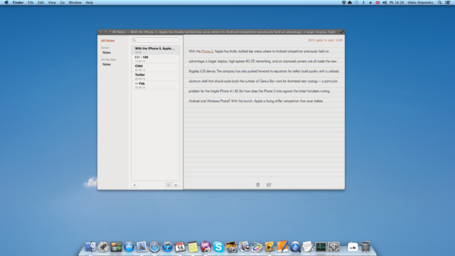
I’ll try to keep it simple. I do not like skeuomorphism at all. It kinda makes sense and works on iOS, because you actually hold the device and touch with your fingers, but whyyyyy on the Mac… hate it. So I had nothing to do and took scissors and brush and pulled the damn leather off my Mac running Mountain Lion. I shared this for a friendly discussion about skeuomorphism and how does it improve anything?

Let’s call this an experiment about how the ML would look without skeuomorphism crap.

The Verge Forums

Notes editor without skeumorphism

It looks so… Usable! I’m seriously worried about the direction Apple is taking with Mac OS X (( yes, i still call it by its name, Mac OS X! )) and just looking at this experiment makes me understand and have a better feel of why i loathe the current appearance and working of some of Apple’s recent apps.

The worst thing about it is that it feels like Jekyll and Hyde. There’s effectively two Apples. I fell in love by the clean, minimalistic one and now i’m afraid i will have to endure the ugly, excessive, noveau-riche silly one. I’m still on Snow Leopard very much (also) due to this. Maybe i will update to Mountain Lion but seriously, i’m waiting. And hoping desperately that by 10.9 Apple and Mac OS X will get back on track.

But i make no idle threats. Because, unfortunately, there’s no other option out there. And that just makes me sad.