Design at Microsoft

The full interview is really interesting and you can find it at The Verge.

Loved the subtle tips about coherence between hardware and software going to the font used on keyboards. Again, that is something that probably very few would even think about it but if used would definitely improve the user perception of a single, cohesive and user-friendly system.

On the down side, they had to wait to 2009 to share the color palettes and compare designs between internal Microsoft orgs?!

The question is, if they have designers of this quality, why haven’t they managed to change the crashing train before?…

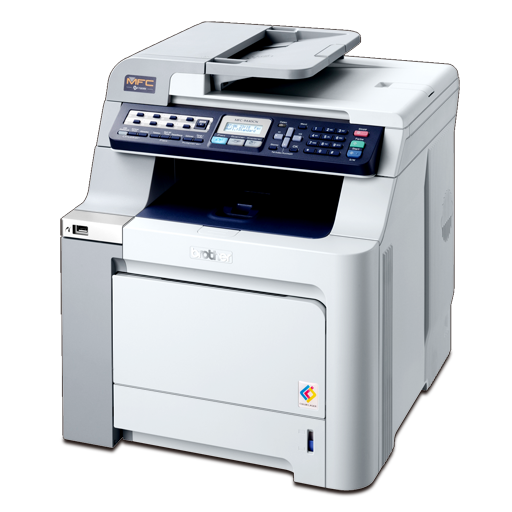
Printer catalog

BRCL9440

Want to see something really cool?

Open Finder, select your Mac hard disk on the left, then select the /Library folder on your disk top level. Now type “icns” on the Search field (upper right corner of finder window) and select “Search: Library” and “File Name”.

You should now be watching a Finder window filled of magnificent icons representing real life printers, plotters, scanners and other assorted hardware.

Zoom in to the maximum. Scroll down. Now say “Ahhhh!”.

The realism and detail level on these things is amazing. You can actually recognize any physical printer that you use, down to the numbers on its keys. And there is an endless supply of them. I thought the nice icons i usually see on the printer preferences pane was only done to for the high price / office grade printers i usually use but it’s for all of them. Brother, Cannon, HP, you name it. On my case i can even see the Texas calculator i use.

Of course, many of these icons are in fact pictures converted in to icons (512×512 pixels max), but there are also drawn icons and pictures converted to drawing. All in all, an amazing attention to detail, even on the simpler icon level.