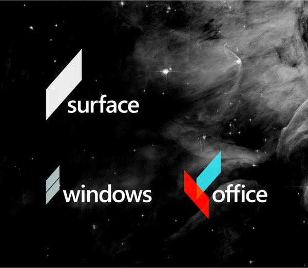
Andrew Kim – Minimally Minimal
I find this proposal amazing. Very well conceived, it doesn’t completely deviate from the past but it is definitely light-years ahead.
What i find most interesting is that i’ve seen a dozen or so of new design proposals for Microsoft or Microsoft products in the last 6 months. That means two things i think: a) everyone “senses” that Microsoft is in trouble and fighting to stay relevant; b) that most of its products need a serious redesign to remove clutter, excess decoration and garish colours and just simply be more friendly. What i find most amazing is how that message has managed to miss Redmond completely. Don’t they browse the web sometimes?
